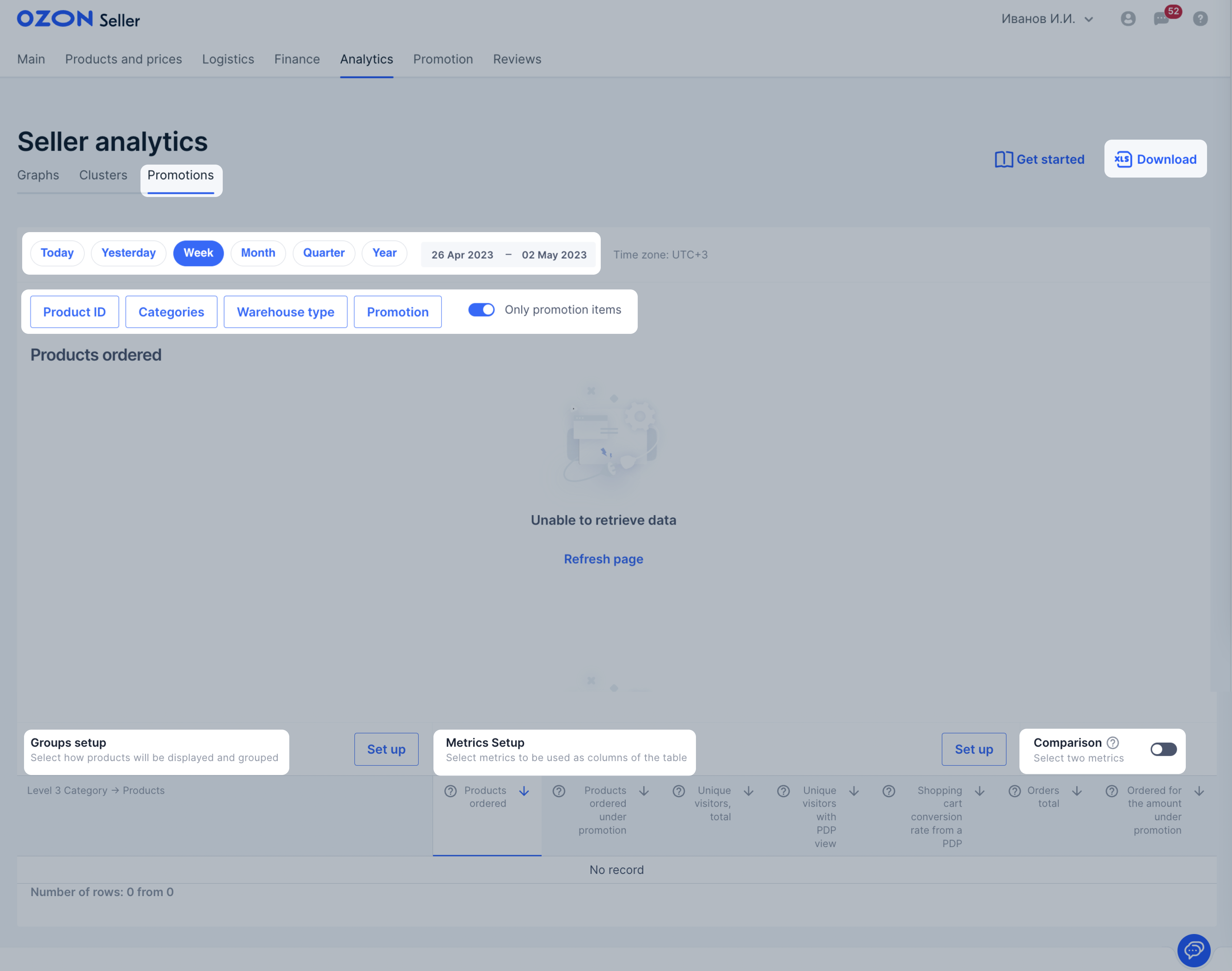
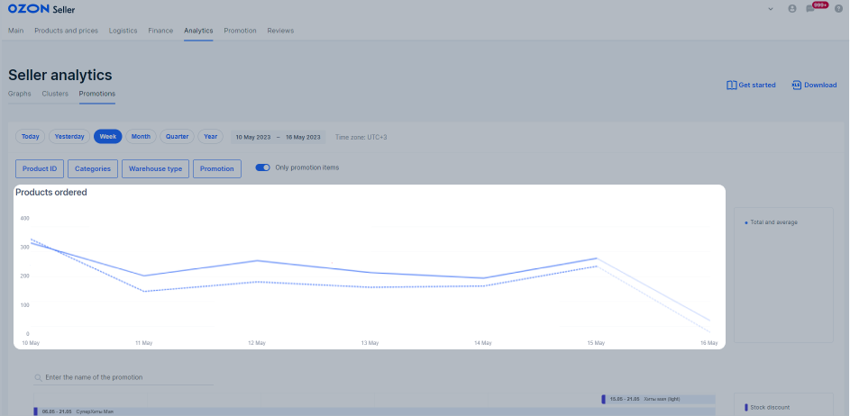
In the Analytics → Promotions section you can see how promotions affect the number of orders, earnings, and views and decide on further promotion, the choice of promotional mechanics, and the discount amounts.
Basic settings #
You can use the basic settings to analyze:
- what promotions the products participated in and how this affected the overall metrics;
- which promotional mechanics bring the most orders;
- which products are more popular during the sales period.
List of basic settings:
-
Report period—select any period for the sales report: for today, yesterday, week, month, or quarter.
-
Filters:
- Category: for analyzing an entire product category.
- Warehouse type: all the products sold from the Ozon warehouse, the seller’s warehouse, or delivered from abroad.
- Promotion: metrics and a list of products for selected promotions.
-
“Only promotional items” switch to view analytics only for products that participated in promotions. By default, the graph displays general analytics for all products. You’ll be able to compare how products that participate and don’t participate in sales are sold during promotions.
-
Graph—hover over it to view the total and average number of orders per day and find out the difference from the previous one.
-
Promotions calendar to view which promotions you participated in and their terms. To view the card with the mechanics details and special offers, hover over the promotion row.
-
Metrics—select four basic metrics that will be shown on the graph:
- Ordered products.
- Ordered products for the promotion.
- Ordered for the amount.
- Ordered for the amount under the promotion.
Additional settings #
You can use the additional settings to:
- Analyze the categories, models, and brands that sell best during the promotion period.
- Track how many customers have viewed the promotional PDP. If there were a lot of views and few sales, you might need to work on the PDP descriptions for the next promotion.
Additional settings include:
- Extended report period—view the data for the year or set up an individual period in the calendar.
- Additional filter by SKU—manually select one or more products by their Ozon SKU.
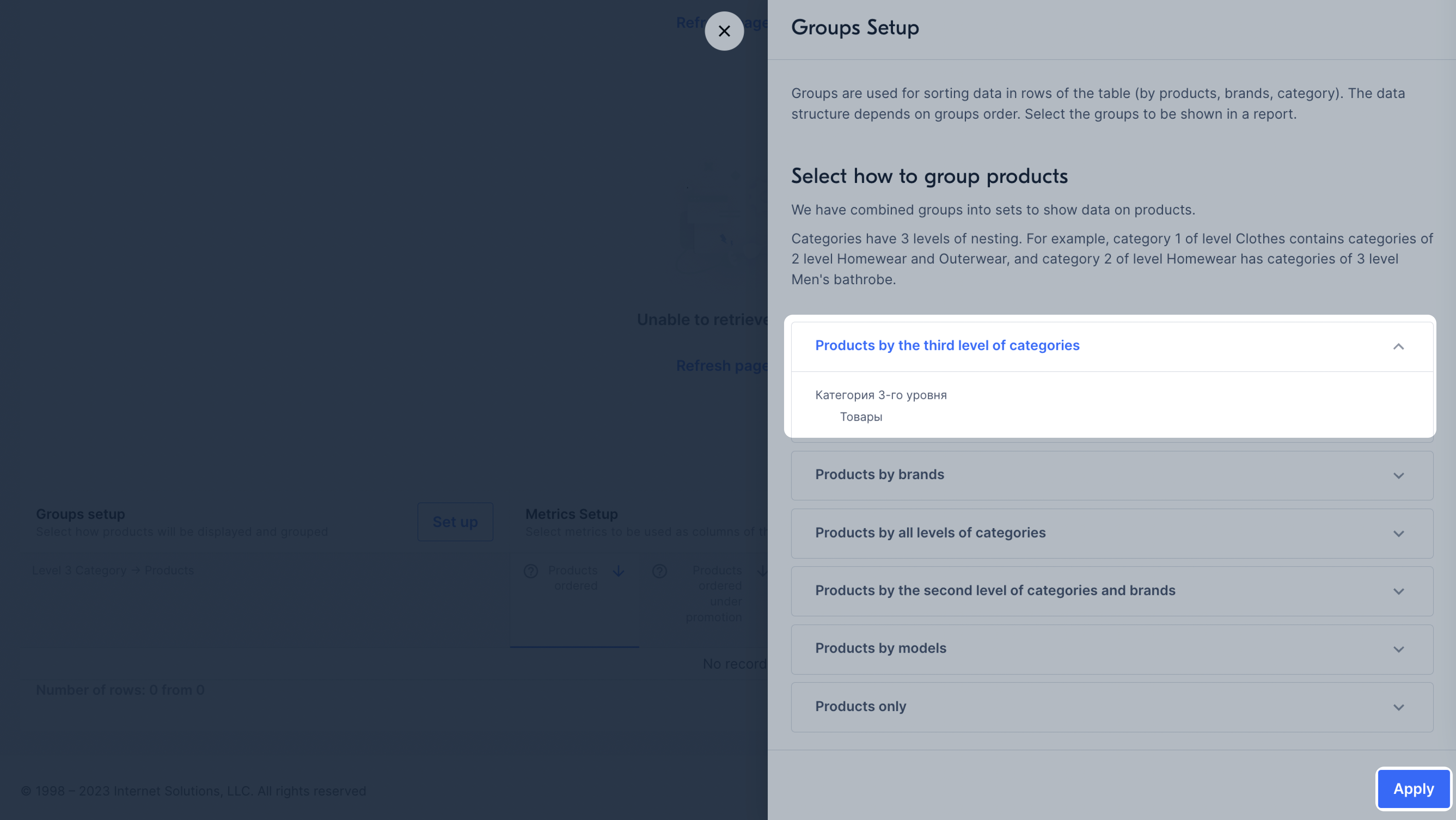
- Groupings—select how products will be displayed on the graph: by category, brand, or model.
How to set up groupings - Metrics—select additional metrics that will be displayed on the graph: the number of canceled and returned
products, PDP visitors, conversion.
How to set up metrics - Comparison of metrics—compare the two metrics.
- Export—download the data to your computer in XLSX format by days or in a variant set up in your personal account.
Promotion groupings #
Data is shown on the graph in groupings:
- Products by level 3 category. There will be products of level 3 category in the analytics, for example, “Women’s Sweater”, which has level 2, “Women’s Clothing”, and level 1, “Clothing”.
- Products by brand: all products of a certain brand of the seller.
- Products for all levels of categories: products will be divided into groups by level 1 categories. To view the nested subcategories and products, expand them.
- Products by level 2 categories, taking into account brands. The products will be divided into groups by level 2 categories: brands and products are nested.
- Products by models: sales of certain product models.
- Only products: without splitting into groups.
Set up #
-
In the lower left corner of the graph, in the Grouping setup block, click Set up.
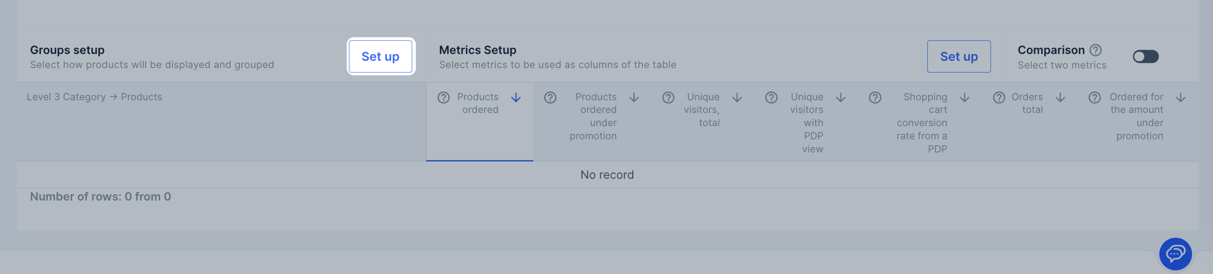
-
Click the necessary grouping and view how the data will be displayed.
-
Select a grouping and click Apply.
By default, the graph displays the Total and average field values. You can add data for other
groups, categories, models or products. To do this, click
![]() next to its name.
To hide it, click the icon again.
next to its name.
To hide it, click the icon again.
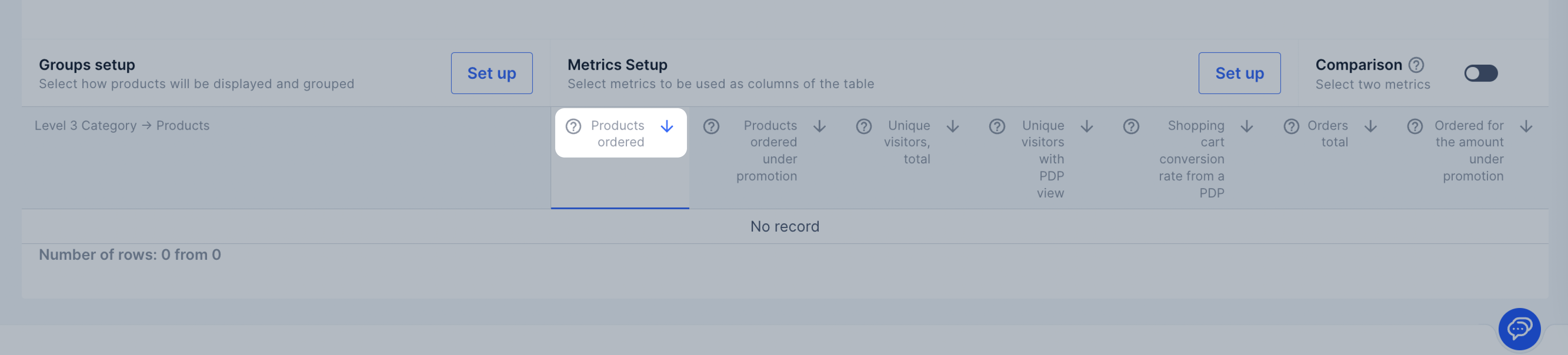
Metrics #
Metrics show the data that will be displayed in the table and on the graph for each product. They are combined into ready-made sets:
- Basic metrics.
- Visitors.
- Impressions.
- Conversion to cart.
- Additions to cart.
- Products by status.
- Sales.
You can select sets of metrics for promotions:
- Ordered under the promotion: the number of products ordered under the promotion.
- Ordered for the amount under the promotion: the cost of products ordered under the promotion.
Set up #
By default, a set of “Basic metrics” is shown in the Metrics setion, and the graph is based on the “Ordered products” metric. To display another metric on the graph, click its name.
To add another set to the page:
- In the lower right corner of the graph in the Metrics setup block, click Set up.
- Select a set of metrics and click Apply.
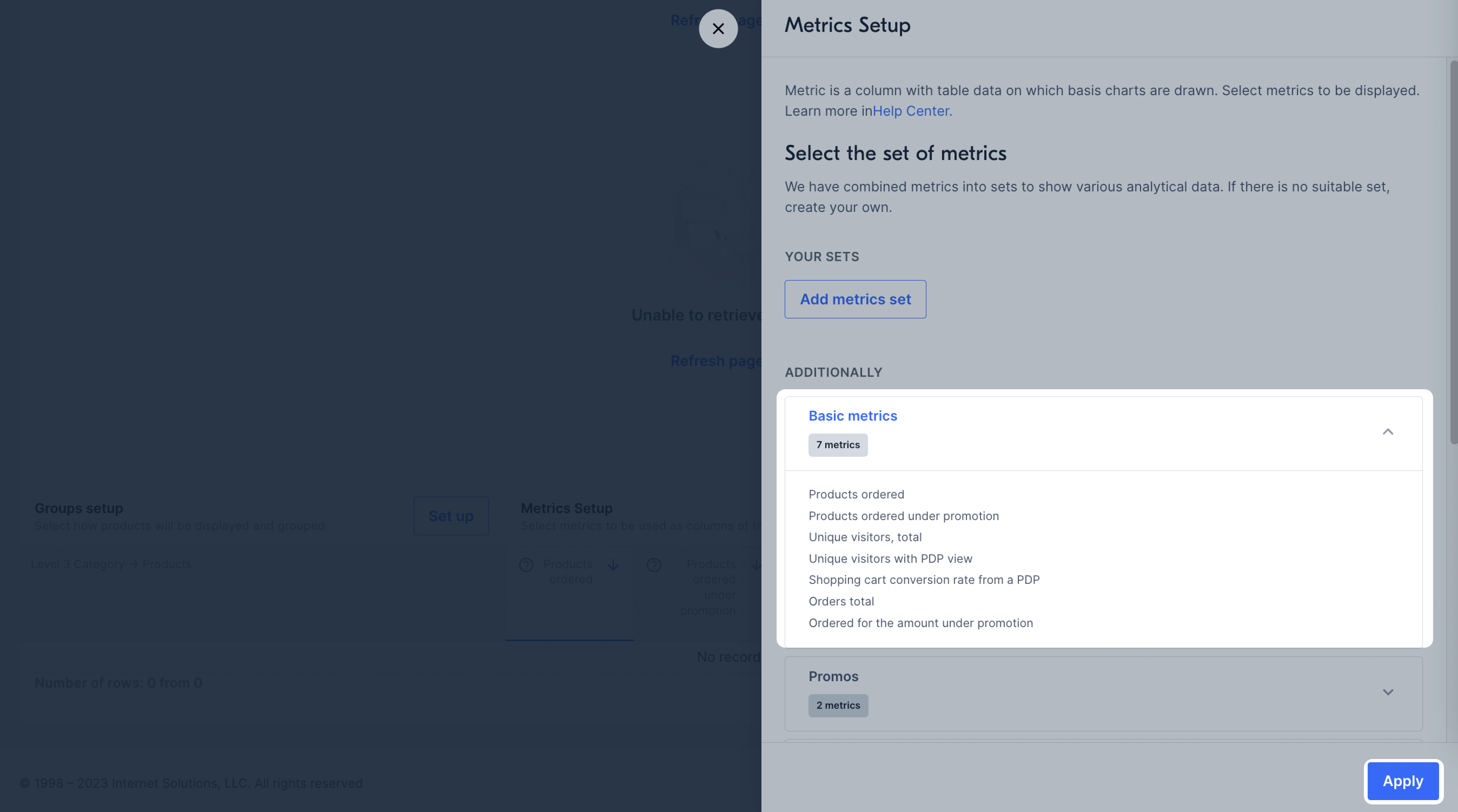
Create your own set #
You can create your own set if the pre-made ones don’t meet your needs:
- In the Metrics setup block, click Set up.
- Click Add metrics set.
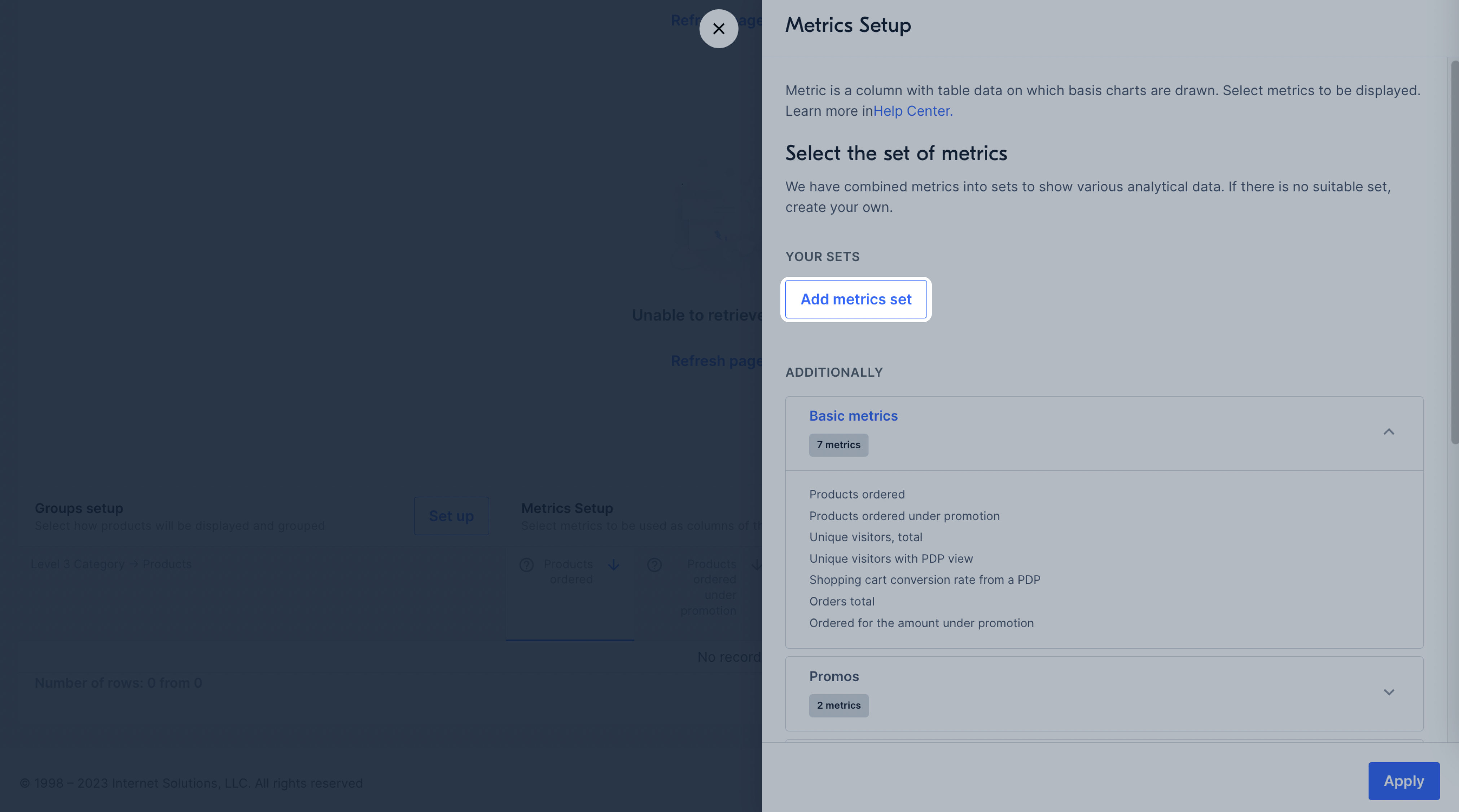
- Enter the set name, select metrics, and click Save.
The selected metrics will be displayed on the graph.
To sort the metric values in descending or ascending order, click
![]() next to its name.
next to its name.
Compare #
You can compare two metrics on a graph. To do this, in the Comparison block, select
![]() and click the names of the
two metrics. By default, the first metric for comparison is Ordered products. To select the second one, hover over its name
and click Compare. The new metric will be displayed on the graph as a dotted line.
and click the names of the
two metrics. By default, the first metric for comparison is Ordered products. To select the second one, hover over its name
and click Compare. The new metric will be displayed on the graph as a dotted line.
To hide a metric, hover over its name and click Remove from comparison.
On the graph, you can compare the total number of products ordered and the number of products ordered under the promotion.